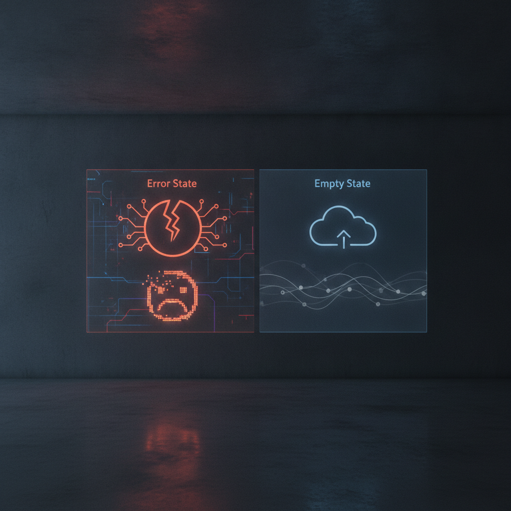
Error States and Empty States: Designing for When Things Go Wrong
Understanding Error and Empty States
In the realm of user experience design, error states and empty states are critical elements that often go unnoticed until users encounter them. These states represent moments of disruption in the user journey, where things don’t go as planned. Designing for these situations is essential in creating a seamless and user-friendly experience.
The Importance of Error States
Error states occur when something goes wrong during a user’s interaction with a product. This could range from a broken link to a failed form submission. Irrespective of the cause, users must be guided through these mishaps
Key Considerations for Designing Error States:- Clear Communication: Use straightforward language to explain what went wrong.
- Actionable Solutions: Provide users with steps they can take to rectify the issue.
- Visual Cues: Utilize icons or colors to signify the severity of the error.
"A well-designed error state turns frustration into clarity, allowing users to regain control and continue their journey."
Empty States: When There’s Nothing to Display
Empty states come into play when there is no content to show, such as when a user first visits an application or when a search yields no results. These moments can often lead to confusion or disappointment if not addressed properly.
- Encouragement: Use positive messaging to invite users to take action, such as creating new content.
- Guidance: Offer tips or suggestions on how to populate the space or achieve desired results.
- Visual Elements: Incorporate illustrations or animations to make empty states feel less barren and more engaging.
"An effective empty state can transform a moment of nothingness into an opportunity for users to explore and engage."
Conclusion
Designing for error and empty states is not merely a technical necessity; it is a chance to enhance user experience and build a connection with your audience. By anticipating these moments and crafting thoughtful responses, designers can ensure that users feel supported and empowered, even when things go awry. Remember, how you handle these states can significantly impact user satisfaction and retention.