Dark Mode Design: More Than Just Inverting Colours

Understanding Dark Mode
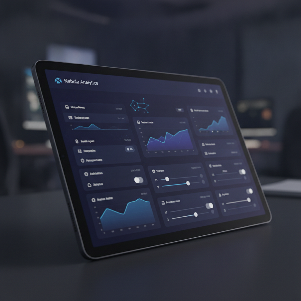
In recent years, the popularity of dark mode has surged across various applications and platforms. While it may seem like a simple aesthetic choice—merely inverting colors—there is much more to the design philosophy behind this trend. Dark mode is not just about dark backgrounds; it’s about enhancing user experience, improving accessibility, and minimizing eye strain.
The Psychology of Dark Mode
Dark mode can significantly influence how users perceive and engage with a digital interface. Many users find that darker screens are visually calming and less harsh on the eyes, especially in low-light environments. This psychological comfort can lead to longer usage times and a more enjoyable interaction with the content.
It’s not just about preference; it’s about creating an environment that fosters focus and reduces distractions.Accessibility Considerations
While dark mode is often lauded for its aesthetic appeal, designers must also consider accessibility. Not all users perceive colors in the same way. For individuals with visual impairments or dyslexia, the contrast levels and color choices in dark mode can either enhance or hinder readability. Thus, thoughtful design is essential to ensure that dark mode remains usable for everyone.
“Design is not just what it looks like and feels like. Design is how it works.” – Steve Jobs
Design Elements Beyond Color
When implementing dark mode, designers must consider more than just color inversion. Elements such as contrast ratios, typography, and layout play crucial roles in creating an effective dark mode experience. High contrast between text and background colors is vital for legibility, while typefaces should be chosen for their clarity in low-light conditions.
Moreover, subtle design elements like shadows and highlights can add depth, making the interface feel more engaging and less flat, which is a common pitfall of poorly executed dark modes.The Future of Dark Mode
As we move forward, dark mode is likely to evolve beyond its current iteration. Designers will continue to explore innovative ways to incorporate dark themes without compromising usability or aesthetic balance. The challenge lies in creating a cohesive experience that balances visual appeal with functional excellence.
In conclusion, dark mode is more than merely inverting colors; it encompasses a holistic approach to design that prioritizes user comfort, accessibility, and engagement. By understanding its nuances, designers can create experiences that resonate deeply with users, paving the way for a brighter future in interface design.